Optimizing a website with Optimizely Commerce Cloud P1| Niteco


Introduction
Architecting a great web solution for both CMS and Commerce is a complex process. Optimizely provides us with many tools to allow us to create a functionally rich solution that can meet the customer’s needs, such as:
- A framework (via Nuget) for building and working with the platform.
- Many open-source packages created by developers, partners and Optimizely themselves.
- Example implementations with the likes of Alloy, Quicksilver, Foundation, and the SPA reference sites.
- World, Academy and Expert Services for help and support and an amazing community.

However, creating a great customer-centric experience is about more than just delivering a solution that meets the organization’s business goals. It is also about the core non-functional requirements that create a performant, secure, well-optimized solution that also provides the end user with a great experience and promotes brand loyalty.
For this series of blog posts, I am going to be talking about how to optimize an Optimizely Commerce website to meet those needs, in both the back-end and the front-end code.
In Part 1, I will delve into the anatomy of Front-End Performance. In part 2, I will be talking about Back-End Optimization and touch on the new CMS 12 and Commerce 14 updates, explaining what they and .NET 5 mean to performance.
Measuring front-end performance
Before we can understand what we must do to optimize performance, we must first understand against what metrics we are gauging the solution and what tools we will use to measure them.
Core Web Vitals
To create an engaging experience that is optimized for the user, we need some metrics that define this. Luckily, with Google’s prominent position with its behemoth search engine presence, they have some thoughts about this: enter the Core Web Vitals (https://web.dev/vitals/).
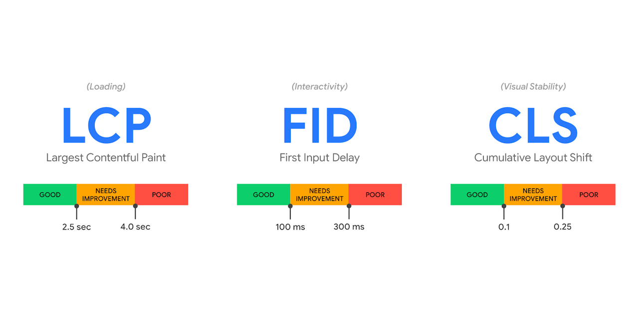
Core Web Vitals are a set of metrics that Google developed that measure the performance of a web page.
- Largest Contentful Paint (LCP) – This metric measures Loading - specifically, when the main content in the page has fully loaded - and provides a good idea of when the page is usable. A time under 2.5 seconds is Google’s threshold for a good user experience. However, at Niteco we aim for 1.5 seconds or under to keep the experience as good as possible.
- First Input Delay (FID) – This metric measures Interactivity – essentially, how long it takes from the page’s first contentful paint (FCP) until core elements become interactive. This is important because we want interactions to be possible as soon as the content is there in the browser. We aim for 0.1 seconds or less for this metric.
- Cumulative Layout Shift (CLS) – This metric measures Visual Stability. It measures whether there is a substantial shift of content as DOM elements are loaded in once the initial page has loaded. For example, when images are lazy loaded in and push all your content around, you will be causing interaction issues for the end user. We aim for 0.03 seconds or less to give a great experience that does not move.
By measuring these 3 at the least, you make sure you have a web page that loads quickly, supports fast user interaction, and provides stability so the user has a great experience.
And as we have mentioned before, this is driven by Google and now has direct impact on your SEO score.
So how do we measure this performance?
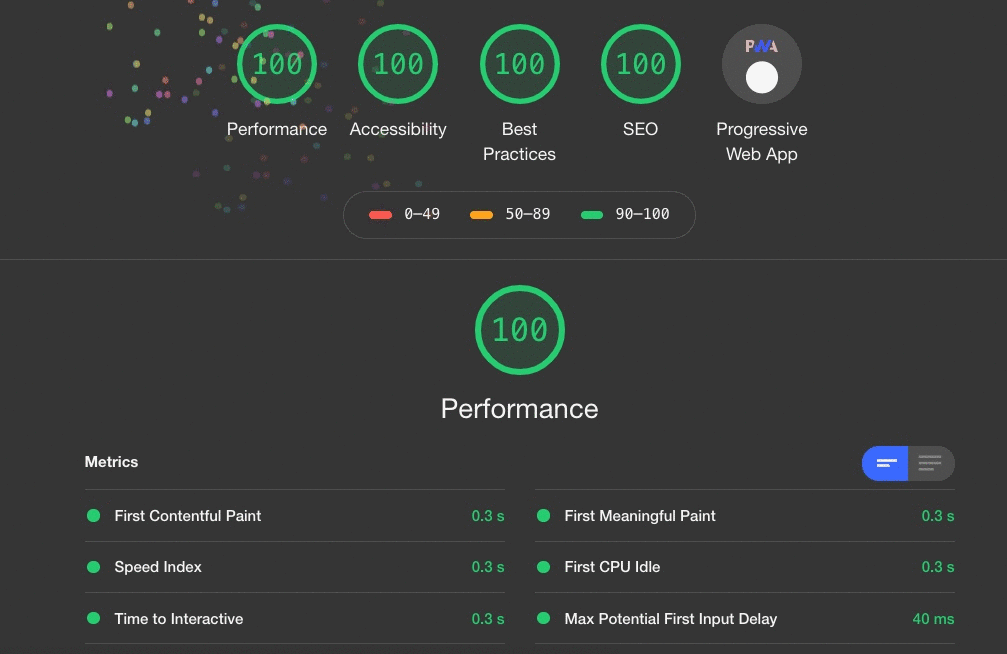
Lighthouse
This is a tool that analyzes many different metrics around web vitals, performance, accessibility, device load times and more. It gives us a useful, accurate scope and breakdown of information.
We run this by
- Opening the webpage we want to test in Google Chrome.
- Opening Devtools by pressing F12.
- Clicking on the lighthouse tab.
- Clicking “Generate Report”.
The beauty of doing it in Chrome is it allows you to create a report on any site you can browse. This means that if you have a website with IP Restrictions or an authentication requirement that an online tool cannot access, you can simply use Chrome.
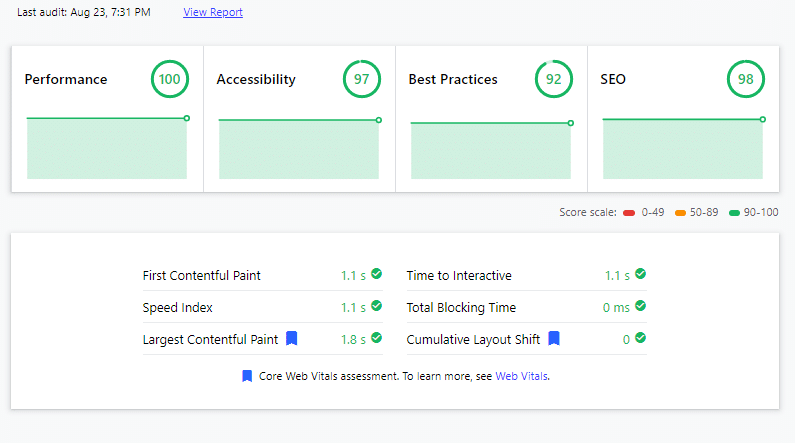
Web.Dev
https://web.dev/measure/ is a Google website that runs the lighthouse tool for us from their server - without any need for us to use Chrome - and simply presents the results. When you need a quick scan, it is very useful, and great for double-checking results.
Speedcurve
Speedcurve is a paid service which also uses Lighthouse to measure the web vitals and metrics of webpages. You can break down the reports into web vitals, explore individual scans, pull out videos of the page rendering and really get a good look at how a page is performing.
There are some benefits with using Speedcurve which make it an excellent choice for both continuous development and having a wider picture of the performance across a range of users:
- You can set up the tests from multiple different desktop, mobile and tablet devices to get a range of device profiles.
- You can set up the tests from multiple edge locations to see performance from different regions.
- You can auto scan at specific time intervals and compare results between scans.
- You can scan via the API, allowing you to hook this into your deployment pipelines.
- You can trigger reports of performance degradation via email to users.
Optimizing performance
In this section, I am going to cover some of the top tips for Optimizing performance for core web vitals. However, you need to keep in mind that there are many performance optimization methods to really make your website stay ahead of the curve, so I will not be revealing all the secrets. For more help with optimizing your Optimizely Ecommerce solution’s performance, contact us at https://niteco.com.
Images
Images are an important part of creating a good-looking, modern experience on the web, but many years of unchecked file formats and little optimization have made them one of the worst offenders when it comes to causing performance issues. Here are a few of our guidelines to follow to make sure you are adhering to best practices. These will allow us to impact our LCP (Largest Contentful Paint) and CLS (Cumulative Layout Shift).
Serve the best formats
When it comes to the size of any asset that is loaded over the web, it is incredibly important to make sure it is as small as possible. For images, this is even more important, as they contain a lot of data. Therefore, we need to make sure we are serving images in the most optimized format.
Currently, the best formats are AVIF and WebP. Whereas AVIF offers better compression, it is not fully supported by all browsers, so if you do offer it, make sure to provide a fallback. WebP is a great format as it is small and has good browser support, but older browsers such as IE do not support it. The recommendation to follow would be to use a fallback rule of AVIF -> WebP -> PNG in your picture elements to achieve the most comprehensive support. The easiest way to do this is to use an image resizer, which I will cover in the back-end part of this blog post.
Check out https://developer.mozilla.org/en-US/docs/Web/Media/Formats/Image_types for a full rundown of file types and their support.
Provide optimized images for breakpoints
We want to save on any unnecessary downloads and have our images be as small as possible. So, it makes sense that we would want to provide optimized images for each of our different channels (mobile, tablet and desktop). Luckily, a fully supported browser feature for picture elements allows us to do exactly that.
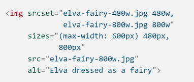
Using this code, we can target a different URL for each of our breakpoints. This means that we can either serve pre-prepared optimized images or use an image resizer to auto-resize a master (largest size per ratio) image.
Always provide width & height
It is important for CLS (Cumulative Layout Shift) that images, when loaded into the browser during rendering, have a height and width set either as attributes or CSS. Otherwise, we can end up with the image loading as a small placeholder and it then pushing out all the other content when the image is loaded. This is the biggest cause of CLS, so this simple technique is key to reducing it.
It is important for CLS (Cumulative Layout Shift) that images, when loaded into the browser during rendering, have a height and width set either as attributes or CSS. Otherwise, we can end up with the image loading as a small placeholder and it then pushing out all the other content when the image is loaded. This is the biggest cause of CLS, so this simple technique is key to reducing it.
Bundling & minification
In the modern web, there are many different types of files a browser must download. We have already covered images in the section above, but we also often encounter very large CSS and JavaScript files which power the look of our website as well as all the client-side functionality.
These files can often end up being as large as 0.5 MB or higher, so it is critically important to do as much as we can to optimize their delivery. By doing so, we can fix render-blocking JavaScript and reduce our FID (First Input Delay).
Bundling
With websites, it is often the case that different CSS and JavaScript files come from many different frameworks and libraries, and even within our own builds will be broken down to pages and components to keep everything clean. However, separating these files for development purposes does not mean we want the user’s browser to have to download every single file, as this will add many requests and a degree of extra overhead.
Therefore, we create bundles. These are logical groupings of files that can all be merged and served as one request. Typically, this bundle is also versioned against its component parts and cached heavily, so not only will it only be served in a single request, but it will be cached for as long as possible, often in a CDN.
This can be done using back-end and front-end technologies, depending on your technology stack.
Minification
JavaScript and CSS files are written in a way that is readable to humans. This means that there are a lot of formatting characters and everything is spaced out on many lines. These extra line spaces and returns can increase the file size. Therefore, a technique called Minification allows us to automatically remove all of these to create a smaller file. In addition, these minifiers are often optimized for each file format, meaning that they could even rewrite JavaScript code to use shorter optimized names for functions, variables, etc. to create an even smaller file.
This can be done using back-end and front-end technologies, depending on your technology stack.
Above the fold rendering
When we are rendering a web page, there is usually a lot of content further down on the page. This can mean that even if we are lazy loading parts of a page, we need to load a lot of extra content such as CSS and JavaScript.
This is where above the fold rendering comes in. If we build our website to be aware of the fold, we can do some clever things. By performing these optimizations, we reduce FID (First Input Delay) as well as improve other metrics.
Optimize CSS and JavaScript in head or bundle
If we take the content which is likely going to be above the “fold” of the website, this means a much smaller footprint of CSS and JavaScript. For example, our CSS files may contain many directives for pages, styles, and components that we do not need when a user first hits a page, so we can do the following to optimize this:
- For each key page, render only the CSS and JavaScript that we need above the fold in the head of the page, so it is served with the page download. This means the browser can start processing and positioning the content straight away.
- Defer the rest of the CSS and JavaScript loading through your bundles.
Optimizing external resources
Modern websites are made up of much more than just the standard content that we serve from our own websites and often have lots of external references such as:
- Google Analytics & Tag Manager
- Tracking
- Advertising
- Social Media
These are just some types of such resources and references. Therefore, it is important for us to do whatever we can to optimize the loading of these external resources.
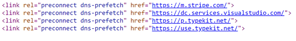
Preconnect & DNS Prefetch
When a browser needs to request an external resource, it must set up a connection to the website/domain where the resource is hosted. The browser must make a best guess when it comes to optimizing this connection. By adding a preconnect and dns-prefetch we can tell the browser which domains/websites we are going to be loading from so it can optimize this process and do the setup up front, therefore optimizing the loading of these resources.
Conclusion
Above, I have listed out some of the ways of measuring front-end performance, allowing you to optimize your Ecommerce website for a great user experience and get some great vitals.
This is only a small list of some of the most common optimizations, and by combining these with many other techniques, we can truly create a great experience that also has a great Google ranking. We at Niteco are experts in this area, so for help with optimizing your Optimizely Ecommerce solution, contact us at Niteco.com.
In the next part of this blog post, I will be covering some of the accompanying back-end techniques to optimize your code and get more great Core Web Vitals stats.